
Unveiling the Palette: Mastering Color Combinations for Embroidery Success.
"Unlock the secrets of successful embroidery with our guide to mastering color combinations. Learn how to select harmonious hues, create depth with shades and tints, and balance warm and cool tones for stunning stitchwork. Elevate your embroidery projects with vibrant colors and captivating combinations. Happy stitching!"
3/29/20242 min read
Mastering Color Combinations in Embroidery: A Guide to Success
Embroidery is not just about needle and thread; it's also an art form that relies heavily on color to create stunning designs. Whether you're stitching intricate florals, bold geometric patterns, or personalized monograms, understanding how to pair colors effectively is essential for achieving visually captivating results. In this guide, we'll explore the principles of color theory and provide practical tips to help you master color combinations in your embroidery projects.
Understanding Color Theory
Before diving into embroidery, it's helpful to have a basic understanding of color theory. Here are some fundamental concepts to keep in mind:
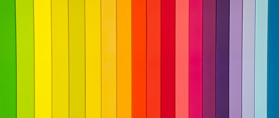
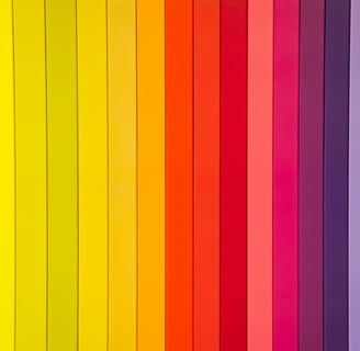
Color Wheel: The color wheel is a visual representation of colors arranged in a circle. It consists of primary colors (red, blue, yellow), secondary colors (orange, green, purple), and tertiary colors (mixtures of primary and secondary colors).
Color Harmony: Color harmony refers to the pleasing arrangement of colors in a design. There are various color harmonies, including complementary (opposite colors on the color wheel), analogous (colors next to each other on the wheel), and triadic (three colors equally spaced on the wheel).
Value and Saturation: Value refers to the lightness or darkness of a color, while saturation refers to its intensity. Understanding value and saturation helps create depth and contrast in embroidery designs.
Tips for Choosing Color Combinations
Now that we've covered the basics of color theory, let's discuss some practical tips for selecting color combinations in your embroidery projects:
Consider the Mood: Think about the mood or theme you want to convey with your embroidery. Warm colors like reds and oranges evoke energy and excitement, while cool colors like blues and greens create a sense of calmness and tranquility.
Start with a Base Color: Choose a dominant color as the base for your embroidery design. This could be the color of the fabric or a prominent element in your pattern.
Experiment with Shades and Tints: Play around with different shades (darker versions) and tints (lighter versions) of your chosen colors to add depth and dimension to your design.
Use Contrast Wisely: Contrast is key to creating visual interest in embroidery. Pairing light and dark colors, complementary colors, or colors with varying saturations can enhance the overall impact of your design.
Balance Warm and Cool Tones: Incorporate both warm and cool tones into your color palette to achieve a harmonious balance. This creates contrast and prevents your embroidery from looking too monotonous.
Test Before Stitching: Before committing to a color combination, experiment with different threads on a scrap piece of fabric. This allows you to see how the colors interact and make adjustments as needed.
Conclusion
Color plays a pivotal role in the success of any embroidery project. By understanding the principles of color theory and applying practical tips for selecting color combinations, you can create embroidery designs that are not only visually stunning but also convey the mood and message you desire. So, embrace your creativity, experiment with color, and watch as your embroidery projects come to life with vibrant hues and captivating combinations. Happy stitching! 🧵✨
www.designet.shop